Bringing Research Guides up to speed with the U-M Library Design System
Project snapshot
We refreshed the user interface of the Research Guides platform to bring it up to speed with the University of Michigan Library Design System. We also redesigned the homepage to provide more context to new users about how to find what they’re looking for. See the live site at guides.lib.umich.edu, and compare to the old site by reading on.
The team
UI/UX Designer (that's me)
Front-End Developer
Product Owners (2)
Project background & constraints
Research Guides contains hundreds of custom guides created by library experts who work for U-M. They get to craft their own copy, imagery, styling, and layouts, to an extent, and every guide is unique - meaning many have unresolved accessibility violations as a result.
This project included mostly cosmetic changes, aside from updating the layout of the homepage to improve the experience for new users, disabling some guide-building options to preserve accessibility, and removing some unused features to simplify the site.
This is because our Research Guides platform, like many other universities, is built by a company called Springshare, and has limited structural customization options. The University of Michigan Library is one of few Springshare users who has dramatically improved the UI of their Research Guides platform using just HTML and CSS.
Key design changes
Providing context and new ways to find guides on the homepage
Before the redesign, the homepage lacked details about what research guides actually are, who they are for, and the different types that exist. "Ways to get help" were provided, but it was hard to know where a user would start if they wanted to explore the site from the homepage.
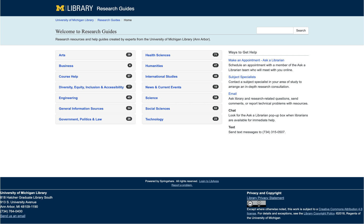
Before: All guides were organized by subject, hidden under an accordion. Default styling from the vendor.
In our redesigned homepage, we highlighted popular how-to guides and created pathways to explore guides of different types, with descriptions of each type. We also updated the copy in the help section to make it more clear and concise.
While we know that users typically access individual guides with direct links from other platforms like Canvas, we wanted to improve the homepage and track engagement with the new design in hopes of increasing overall views of Research Guides.
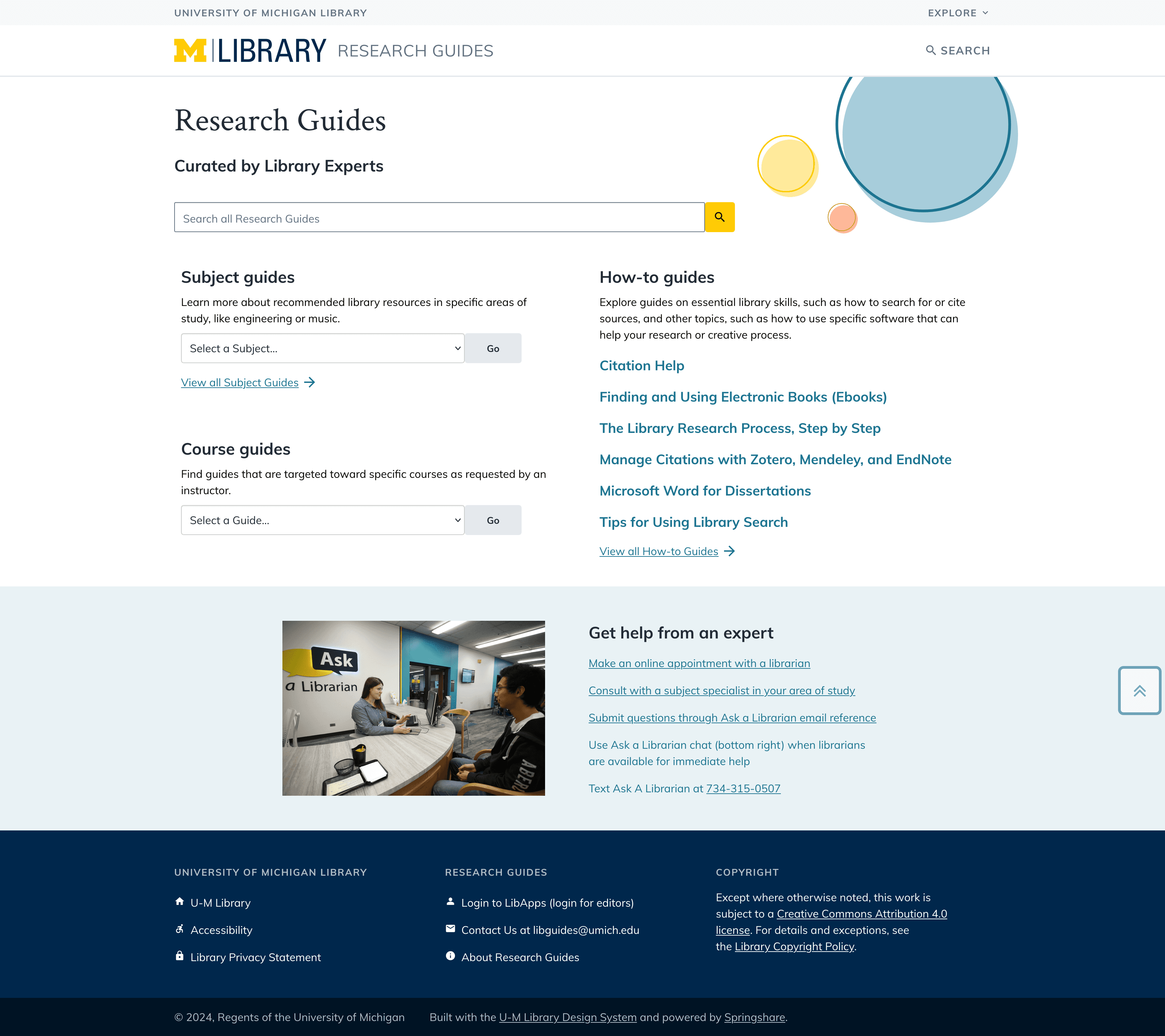
After: More detailed descriptions, new ways to explore guides, and featured how-to guides displayed prominently.
Reworking search boxes with different scopes to prevent friction while searching
In the original design, a search box always appeared in the same place on the page - on the right side of the screen, opposite the page title. The problem was that on the homepage (2), the search box searched the entire site, while on individual guide pages (1), it only searched within that guide.
How were users supposed to know that before pressing "search"?
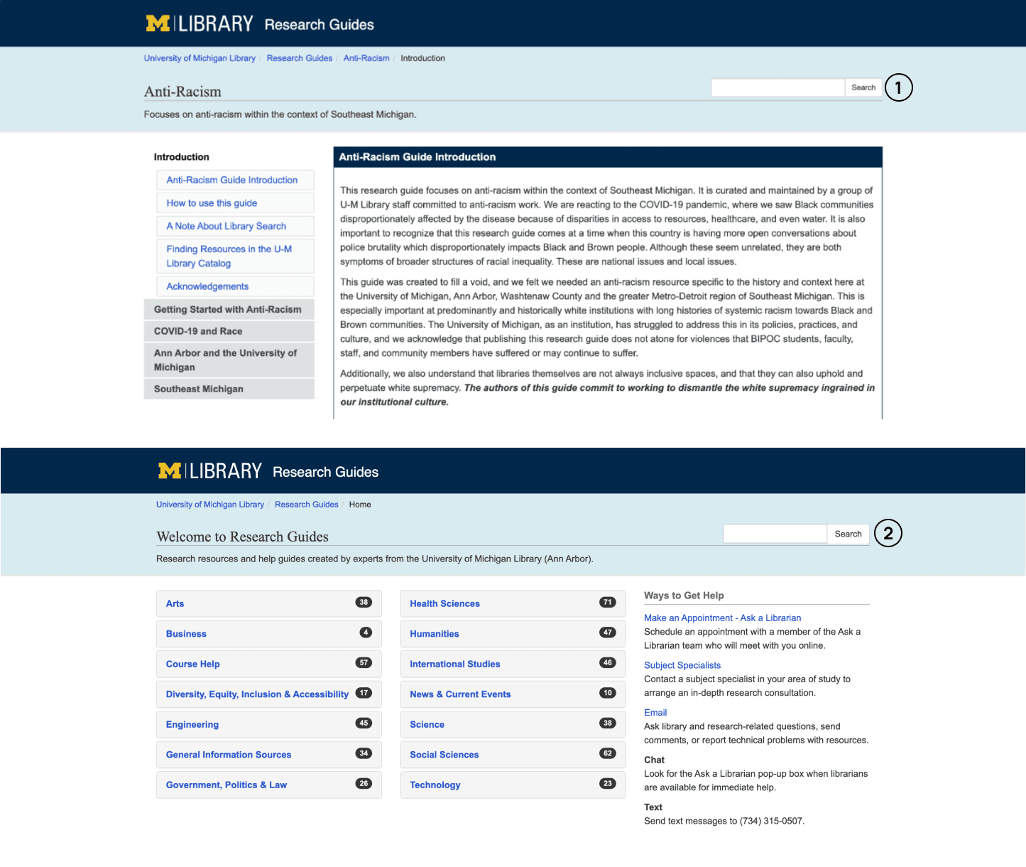
Before: Search bars (labeled 1 and 2 in this image) look the same but are scoped differently. Big usability issue!
Our redesign included two changes to help users understand the scope of their search. First, we changed the location of the homepage search box to highlight it on the page (2), and left the in-guide search box in the top right corner (1). We also added helper text within each input field that says either "Search this site" or "Search this guide", to further clarify the scope of each search box.
This small change will prevent friction that could lead to site abandonment.
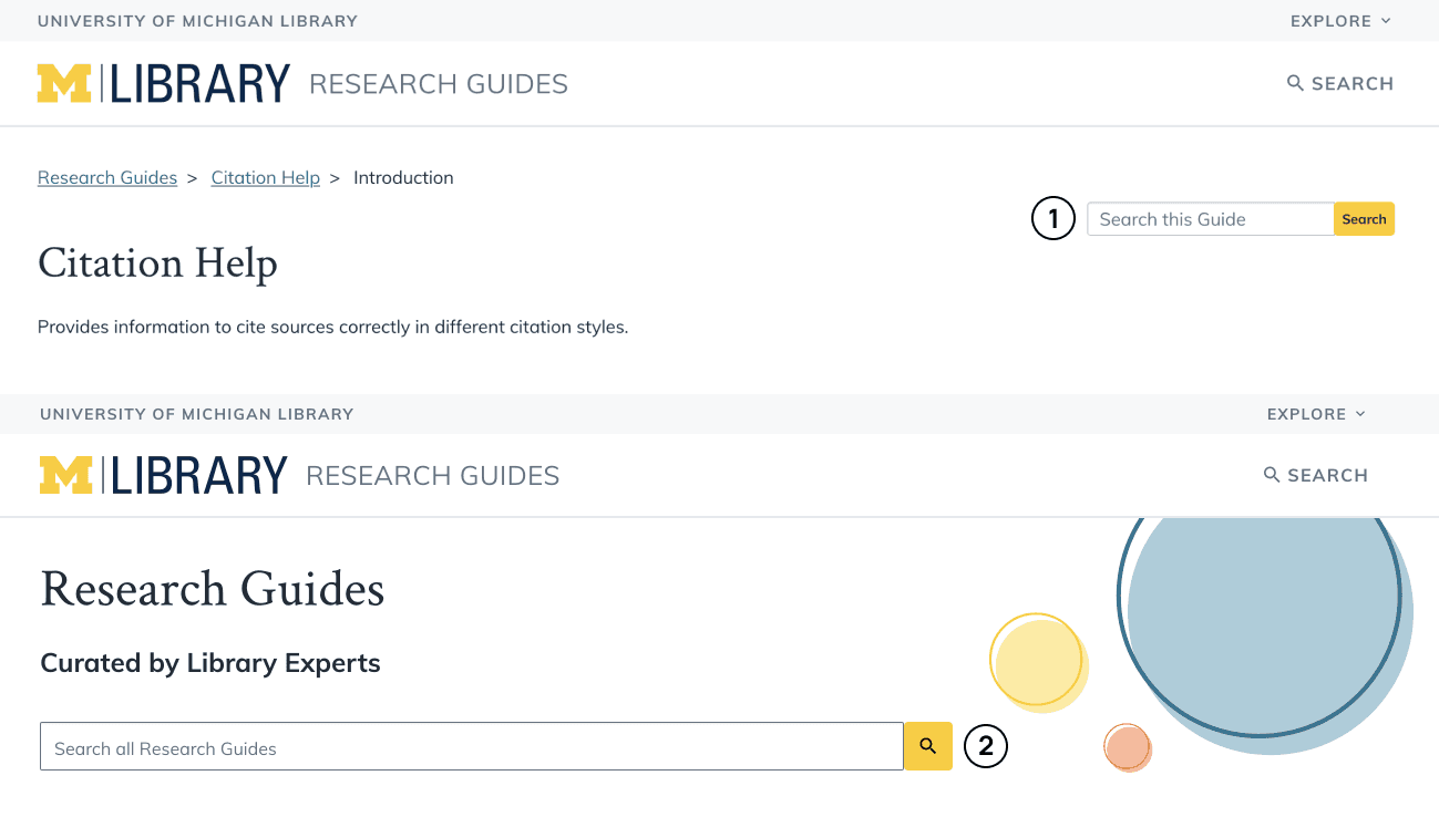
After: Search bars (labeled 1 and 2 in this image) now have clear labels describing their scope, and there is now a link to search all guides in the navigation as well.
Adding a global footer
Depending on page type, a different footer appeared - or sometimes, no footer appeared at all! To improve the consistency of page layouts and to align with typical web standards, we added a global footer that would appear on every page on this platform.
This change required moving some content into the body of in-guide pages, which honestly should have been there the whole time.
This was a simple change that improved every single page of Research Guides!
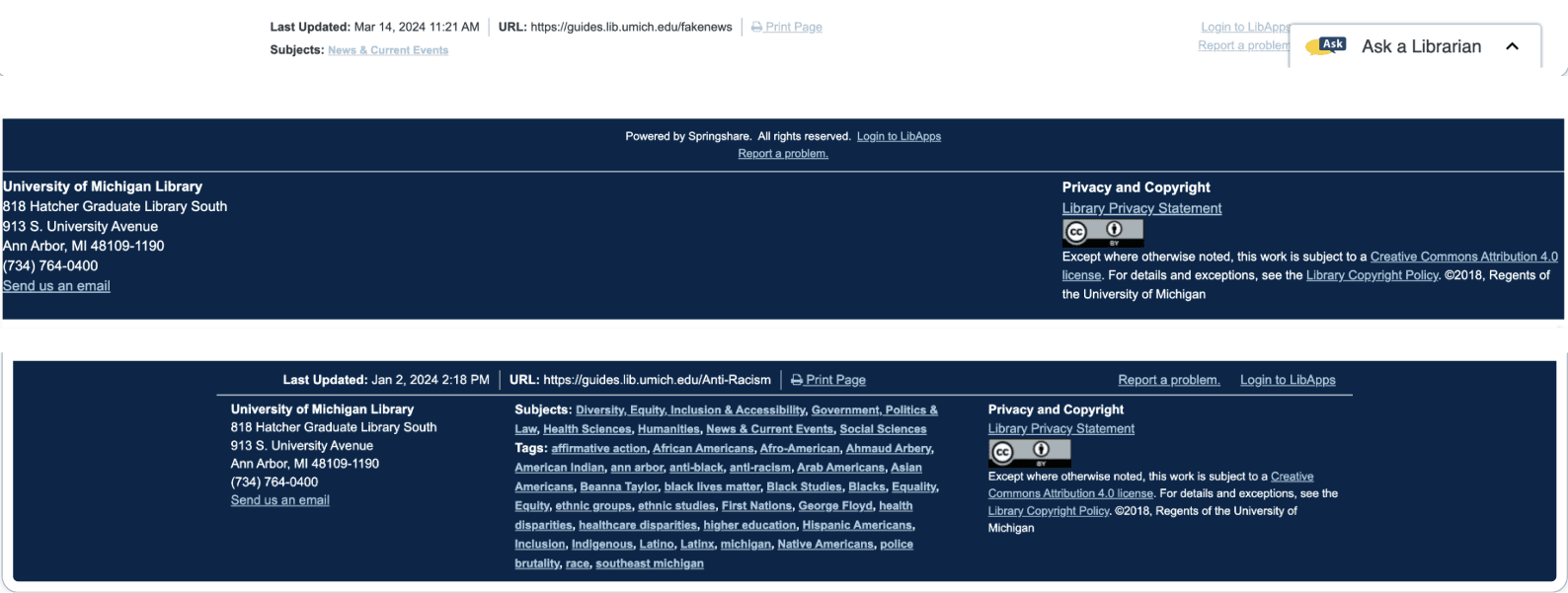
Before: Examples of three different "footers" that existed in the original UI.

After: One footer that appears on every page.
Our design and development approach
Collaboration with the front-end developer to create designs that were achievable within the constraints of the platform while still aligning with our design system.
Collaboration with product owners to update and write new copy and to display new ways to access guides on the home page, to effectively "rebrand" the platform and make it more approachable.
Accessibility as a process: throughout the design and development process, I worked to resolve color contrast and text accessibility issues while the front-end developer addressed more technical accessibility issues.
A bit about the research that informed our design
I reviewed findings from previous product owners' comparative analysis of 17 other university Research Guides home pages. They found aspects of some of these sites appealing, which informed the following design changes:
Display guides by more categories than just subject - other universities invited users to browse or search guides by course number or type.
Provide a short description of each browse category. This text could help new users feel more comfortable exploring the site further.
Provide different points of entry to explore guides. Some sites had clear calls to action at the top of the home page body content, like “Browse all subject guides” or “View all course guides," which could give users a clearer path forward.
In the process of refreshing the UI for this site, discussions with product owners revealed some features that were not used by guide creators or side administrators. We were able to simplify multiple interfaces by removing unnecessary components.
Impact
Research Guides launched our redesign on November 7, 2024. It was met with great appreciation from the product owners, and colleagues at other universities were shocked that we were able to create such a visually appealing UI from the less-than-beautiful default from Springshare. I created custom events in Google Tag Manager to track interactions with the new components we added to the homepage and will be reporting any notable insights to the product team after getting a few months of data.