Turning a technical business plan into an easy-to-understand website with UX & content strategy
Published on Apr 15, 2025

Project snapshot
My client is starting an environmental consulting firm servicing communities across Michigan and requested help building his online presence. As a landscape architect, my client had experience using design software, but after creating a logo and starting to build a website, I took the reins and rebuilt his brand styles and website to improve the professionalism of the firm’s online presence, and most importantly, make it easier for potential customers to learn about the services he provides. See the finished product at starflowerenvironmental.com.
The team
UX Designer & Content Strategist (that's me)
Myles, Client & Founder
Understanding my client’s expertise & defining goals
I scheduled a couple of conversations with Myles to get an idea of who his intended customers are and what he wants to offer to each of them. My plan was to refine what he had already made, rather than totally reinvent the company's brand. A two week timeline made that the best option, as well.
Goal #1: Write content that gets the point across without using industry jargon
My client is an expert in his field - and he writes like an expert, too. I worked with Myles to communicate his services using plain language. Our goals were the same - building authority and getting customers. But, our resulting content visions were in conflict, because he wanted to build authority by conveying his expertise through his technical language, but I wanted him to build a more high-level understanding of his services through plain language, under the assumption that he would have other authority-building content like case studies and testimonials.
Goal #2: Construct a site architecture that caters to users’ identities
Myles’ original site structure was inspired by commercial environmental consulting companies. While I loved that he found inspiration from other websites, there was one missing piece of his strategy - his intended audience was far broader than the companies he was inspired by. The original site structure left it up to the user to figure out what services were relevant to them - increasing their cognitive load, and likely decreasing contracts.
I met with Myles to better understand the services he wanted to offer and who they were intended for, and rebuilt the structure of the site to show paths for different user identities in addition to service categories.
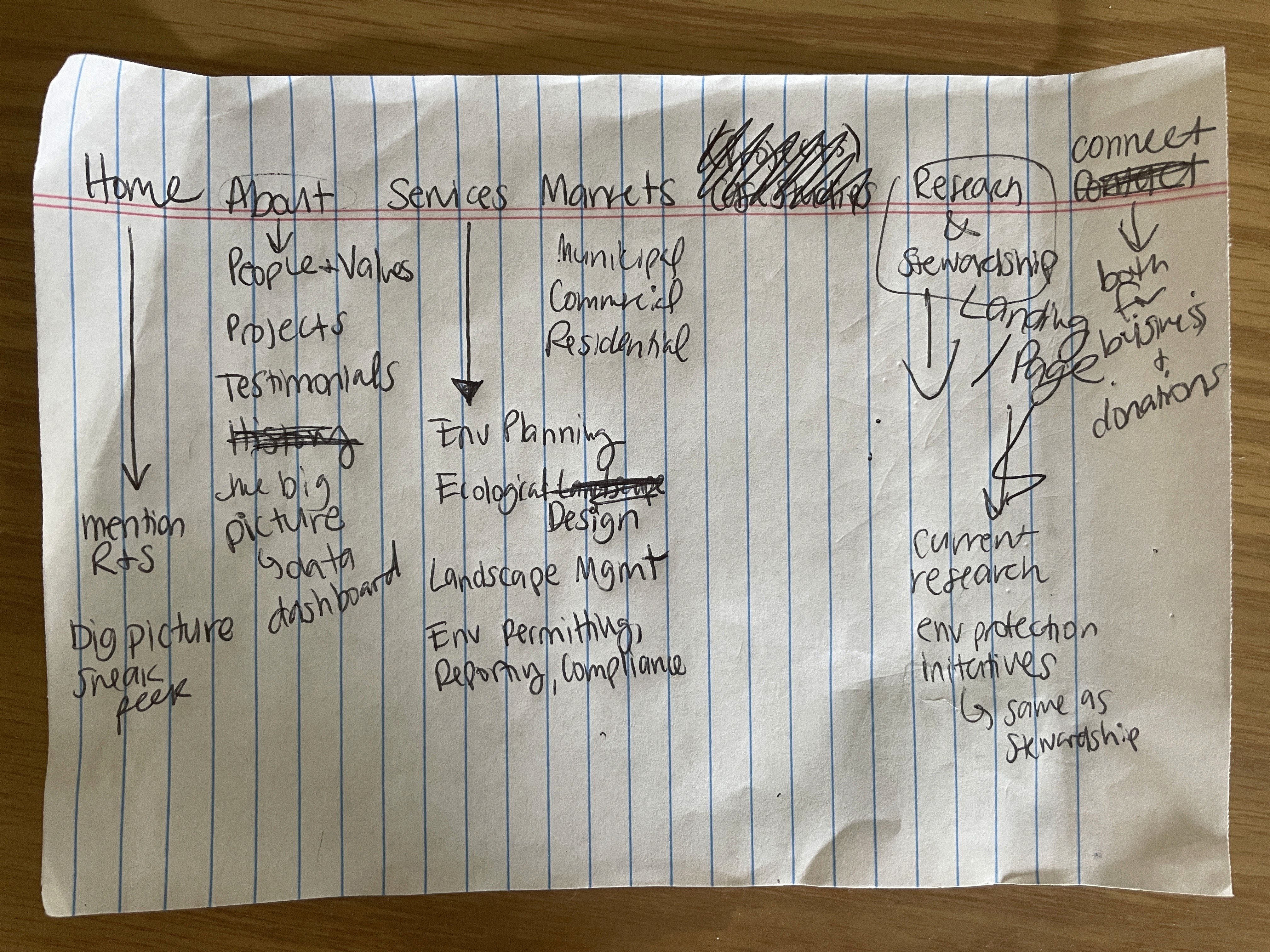
A paper showing the results of a meeting with Myles where we defined a more user-centered site structure. Things still shifted from here, but it was a great starting point.
Building the brand
Myles gave me his original logo and permission to change it up a bit as I rebuilt it as a vector drawing. I liked the idea of his version, but there was a lot of detail in the mark itself that would be lost when it was placed at a small size. I presented some simplified ideas to him, and we settled on the simplest version for this launch, but saved the others for future variations.
I stuck with the colors he initially selected, but provided some guidance about color contrast in regard to visual accessibility, letting him know which colors could be used with black or white text and how to check for color contrast issues using the WebAIM contrast checker. I also adjusted the kerning and spacing between the logo and text.

Before: A logo with a lot of detail and a lot of potential!
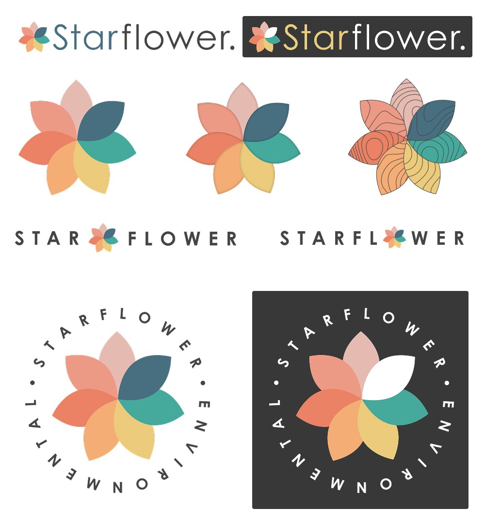
After: a full logo package with many variations and pixel-perfect vectors.
Building the site
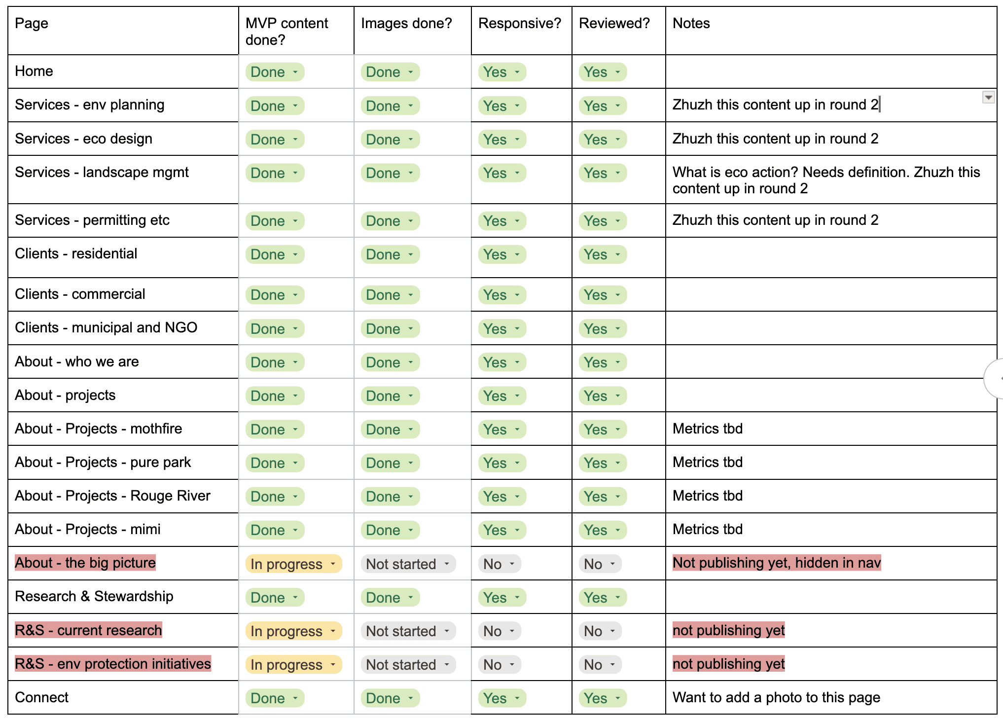
I built Starflower’s site using Framer. I added content in the order that Myles drafted it, and suggested content edits and different layouts as I built, since he was hoping to get the site published within a couple of weeks. I tracked my tasks, content requests, and client reviews with a detailed site build tracking system to ensure we launched a professional, responsive website in Myles’ ideal time frame with room to grow from there.
The site includes plenty of authority-building content in the form of testimonials and case studies, clear paths based on user identities, and we aren’t done yet! Myles plans to showcase his expertise in data science by publishing a data dashboard that celebrates the environmental impact of all of his client work in aggregate, and I look forward to creating his vision.
View the live site at starflowerenvironmental.com. The screenshot below shows one of my favorite layouts, advertising services for residential clients.

What I learned
Remember goal #1? It turns out, it applies to UX Designers, too! It was kind of hilarious how many conversations Myles and I had with each other where we were speaking our own technical languages, me talking about user experience and web development, and him talking about environmental science. This project really illustrated the importance of plain language for me, and we will continue refining the language of this web content as well as his social media advertisements to reach his intended residential audience.
How I’m measuring impact
I set up Google Analytics and Google Search Console for the domain, and I am continuing to offer design and content support as Myles builds his social media presence on Instagram and LinkedIn. The realm of marketing and conversions is new to me as someone who has only worked in research and academia, so this will be a learning experience for both of us. I can confidently create custom analytics events and analyze engagement metrics, but the rest will be new!