Helping students find study spaces in campus libraries with a brand new feature
Published on Mar 12, 2025

Project snapshot
Study spaces are in high demand at the University of Michigan, and at the libraries, it feels like there are never enough of them. To help students identify study spaces on campus suited to their needs, I researched, designed, and evaluated an interactive study space finder for all public library spaces at U-M with improved space metadata, categorization, and findability. This feature is in development as of April 2025 and will launch before the Fall 2025 semester begins.
The team
UI/UX Designer (that's me)
Heidi, Project Manager
Josh, Front-End Developer
Eliot, Full-Stack Developer
Project background & constraints
The redesigned library website launched in 2020, and has had a growing list of desired improvements since then - one of those being adding an interactive study space finder. The site was built with a Drupal CMS, and as a result, we had significant data- and template-related constraints to work within.
Phase 1: Research, research, research!
Our desire to have an interactive study space finder was not a unique one - many other university libraries had implemented some version of this idea, so we looked to those examples for inspiration for our own. We interviewed 15 students and asked them to look at the study space finders for libraries at Duke, Cambridge, NYU, and UT Austin.
Features we (and the students we interviewed) liked:
Noise levels
Informative images
What tools or features are available in a space
Building hours
Categorization of spaces as bookable or non-bookable
Phase 2: Initial designs and content
With this guidance from users, I designed an initial version of our study space finder using the U-M Library Design System.

Study space finder design showing features of spaces, locations and hours, and noise levels. Users can filter by building, noise level, and feature.

An individual study space page, showing the space's noise level, features, building location and directions, and hours, as well as a link to book the space.
Phase 3: More user testing and many design iterations
We learned the following from our student participants:
Students trust images more than words
Even if a space said it had, for example, high-top tables, students would not trust that statement unless they saw it reflected in the image of the space. While we won’t be able to showcase every aspect of some spaces in a single photo, this experience led us to prioritize improving the accuracy and quality of the photos we display for individual spaces.
The descriptions of noise levels weren’t clear
Other universities described the noise levels in spaces in many different ways. Some used icons alone and others used a combination of 2-4 noise levels described in a few words. We opted for a 3-level categorization of “silent,” “quiet chatter,” and “active conversation,” but found that while students were consistently looking for that middle-ground noise level similar to what we called “quiet chatter,” those specific words did not give them a consistent idea of how loud those spaces actually are.
Some features, while desirable, were hard to define
Students are often looking for spaces with electrical outlets, and, since the 2020 COVID pandemic, spaces where they can take zoom meetings without disruption. We heard from participants that these two space features were highly desired, but figuring out how to accurately and consistently categorize spaces according to these values proved to be ambiguous and extremely difficult.
All of these issues were addressed with our Space Planning Team in phase 4 as they made final content decisions.
There were also some changes based on real-world design complications.
We had to make one change based on CMS limitations, such as removing the hours from the list page because the dynamic data collection for that specific information would decrease the efficiency of the page load significantly.
I also worked with the design system team to create a reusable design for filters, so we updated that design. We made some other UI styling changes to both pages, too.

An updated version of the study spaces list page, with redesigned filters and some updated content.

An updated individual space page, with new and improved UI styles.
Phase 4: Content development and implementation
We worked with the library’s Space Planning Team within the library to finalize the content for this update, which included improving the noise level and feature descriptions, separating and consolidating some individual space pages, adding categorized values for each space like noise levels and features, and updating the UI template used for each individual space page. We made some final design tweaks as well to improve the UI even more.
Final(ish) designs
This project is still in progress and developers are currently building these designs. We still need to take new photos and finalize some content. Please enjoy this work in progress!
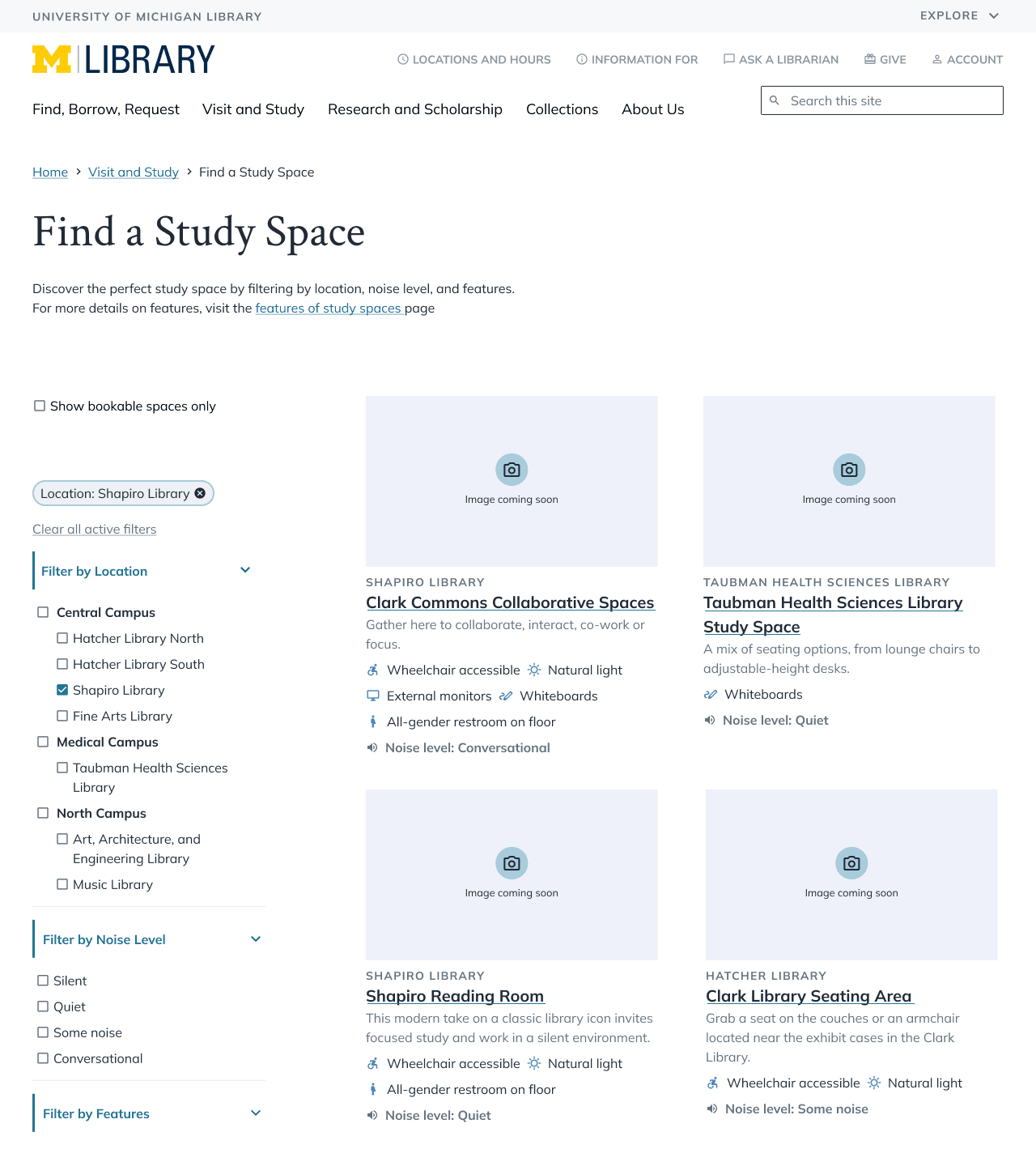
The final design for the study spaces list page with a portion of the new content, including updated noise levels and features.
the final design for an individual space page. We reworked this layout many times because we wanted it to look balanced when there was a lot or a little of content in the body of the page.